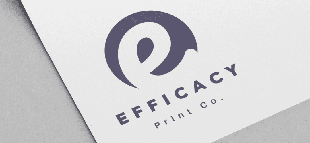
Efficacy Logo Design
An eco painting empire 🎨
An eco painting empire 🎨
An eco painting empire 🎨
A refreshed logo design that captures the brand's dedication to efficiency and effectiveness. Honored to have collaborated with such a reputable company.
A refreshed logo design that captures the brand's dedication to efficiency and effectiveness. Honored to have collaborated with such a reputable company.
A refreshed logo design that captures the brand's dedication to efficiency and effectiveness. Honored to have collaborated with such a reputable company.
Client
Efficacy
Services
Logo Design Mockup
Industry
Printing
Date
29 March, 2023


We are immensely proud to unveil the new logo for Efficacy, a leading company in the printing services industry. Our creative team has been deeply involved in revamping Efficacy's visual identity, aiming to capture the essence of their dedication to efficiency and effectiveness in every aspect of their service. The new logo is a blend of simplicity and sophistication, mirroring Efficacy's approach to providing seamless and reliable printing solutions. We opted for a clean, modern typeface that conveys professionalism and precision, traits synonymous with Efficacy's brand ethos. The color palette is carefully selected to reflect the brand's core values; the dominant colors represent trustworthiness, reliability, and innovation, essential attributes in the printing industry. One of the key features of this logo is its adaptability. It's designed to be versatile, ensuring high visibility and impact across various mediums, from digital platforms to printed materials. This adaptability mirrors Efficacy's ability to cater to diverse printing needs, showcasing their flexibility and customer-centric approach. In addition to the logo, we have introduced graphic elements that symbolize the swift and effective nature of Efficacy's services. These elements are integrated into the logo in a way that enhances its visual appeal while reinforcing the brand message. The overall design is clean and uncluttered, emphasizing Efficacy's commitment to providing straightforward and hassle-free printing services. Our collaboration with Efficacy has been a journey of mutual growth and understanding. We delved deep into understanding their business model, target audience, and industry trends to ensure that the new branding resonates with their clients and stands out in the competitive market. The rebranding of Efficacy is not just a change in their visual identity but a reaffirmation of their pledge to excellence in the printing services sector. We are honored to have played a pivotal role in this transformation and are confident that this new branding will propel Efficacy to new heights in their business endeavors.
We are immensely proud to unveil the new logo for Efficacy, a leading company in the printing services industry. Our creative team has been deeply involved in revamping Efficacy's visual identity, aiming to capture the essence of their dedication to efficiency and effectiveness in every aspect of their service. The new logo is a blend of simplicity and sophistication, mirroring Efficacy's approach to providing seamless and reliable printing solutions. We opted for a clean, modern typeface that conveys professionalism and precision, traits synonymous with Efficacy's brand ethos. The color palette is carefully selected to reflect the brand's core values; the dominant colors represent trustworthiness, reliability, and innovation, essential attributes in the printing industry. One of the key features of this logo is its adaptability. It's designed to be versatile, ensuring high visibility and impact across various mediums, from digital platforms to printed materials. This adaptability mirrors Efficacy's ability to cater to diverse printing needs, showcasing their flexibility and customer-centric approach. In addition to the logo, we have introduced graphic elements that symbolize the swift and effective nature of Efficacy's services. These elements are integrated into the logo in a way that enhances its visual appeal while reinforcing the brand message. The overall design is clean and uncluttered, emphasizing Efficacy's commitment to providing straightforward and hassle-free printing services. Our collaboration with Efficacy has been a journey of mutual growth and understanding. We delved deep into understanding their business model, target audience, and industry trends to ensure that the new branding resonates with their clients and stands out in the competitive market. The rebranding of Efficacy is not just a change in their visual identity but a reaffirmation of their pledge to excellence in the printing services sector. We are honored to have played a pivotal role in this transformation and are confident that this new branding will propel Efficacy to new heights in their business endeavors.
We are immensely proud to unveil the new logo for Efficacy, a leading company in the printing services industry. Our creative team has been deeply involved in revamping Efficacy's visual identity, aiming to capture the essence of their dedication to efficiency and effectiveness in every aspect of their service. The new logo is a blend of simplicity and sophistication, mirroring Efficacy's approach to providing seamless and reliable printing solutions. We opted for a clean, modern typeface that conveys professionalism and precision, traits synonymous with Efficacy's brand ethos. The color palette is carefully selected to reflect the brand's core values; the dominant colors represent trustworthiness, reliability, and innovation, essential attributes in the printing industry. One of the key features of this logo is its adaptability. It's designed to be versatile, ensuring high visibility and impact across various mediums, from digital platforms to printed materials. This adaptability mirrors Efficacy's ability to cater to diverse printing needs, showcasing their flexibility and customer-centric approach. In addition to the logo, we have introduced graphic elements that symbolize the swift and effective nature of Efficacy's services. These elements are integrated into the logo in a way that enhances its visual appeal while reinforcing the brand message. The overall design is clean and uncluttered, emphasizing Efficacy's commitment to providing straightforward and hassle-free printing services. Our collaboration with Efficacy has been a journey of mutual growth and understanding. We delved deep into understanding their business model, target audience, and industry trends to ensure that the new branding resonates with their clients and stands out in the competitive market. The rebranding of Efficacy is not just a change in their visual identity but a reaffirmation of their pledge to excellence in the printing services sector. We are honored to have played a pivotal role in this transformation and are confident that this new branding will propel Efficacy to new heights in their business endeavors.
Building applications, identities, styles, and initiatives that illuminate the globe.
2023 Benkco © All Rights Reserved.
Building applications, identities, styles, and initiatives that illuminate the globe.
2023 Benkco © All Rights Reserved.
Building applications, identities, styles, and initiatives that illuminate the globe.
2023 Benkco © All Rights Reserved.
